The psychology of supermarkets
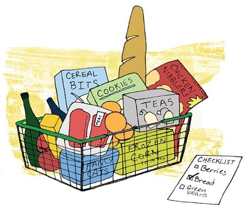
Keep your grocery list handy

Do you ever wonder why you made a quick trip to the grocery store to buy just one or two items, but walked out with a cart full of goods?
That’s because grocery stores are designed to lure you in — and keep you in — to entice you to buy more than just that quart of milk.

Author: Wikipedia Grocery stores often place brightly colored flowers and produce at the entrance to attract your attention.
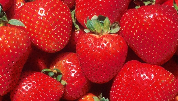
For instance, in most grocery stores, you are greeted by the produce department as soon as you enter. The reds, greens, blues and purples of strawberries, lettuce, blueberries and eggplant catch your eye. This placement of produce is strategic. Research shows that people are drawn to bright colors. In 2010, psychologists from University of California Berkeley found that people are attracted to bright red, blue, and green, while orange and yellow trailed closely behind.
In many stores, the flower shop and bakery are close by the produce. Like the produce, the bright colors of the flowers attract you, while it’s hard to resist the brownies and smell of cookies baking.
Another strategic design is the placement of the dairy section, which is typically far from the entrance towards the back of the store. People stopping in for just a dozen eggs must pass by an array of other products not necessarily on the grocery list.
End caps — displays at the end of aisles — are particularly lucrative for supermarkets. End caps sell eight times faster than the same product shelved elsewhere, according to the National Retail Hardware Association. The end caps also lure consumers into the middle aisles which house a plethora of other foods. The idea from there is that customers will then walk slowly through each aisle, thus prolonging their shopping visit.
Shelf order is another strategic example. More expensive items are at eye level. On lower shelves are generic brands, which, for the most part, are equal in nutrition and quality to brand names, but lower in cost. Consumers must stoop or kneel to retrieve the less expensive substitutes. That takes work. People are more apt to take the easy route and grab products more easily accessible. Cartoon-bearing cereal boxes are also often on lower shelves to captivate the attention of youngsters.
Even the shopping carts play a role, according to a study by marketing consultant Martin Lindstrom. Doubling the size of the shopping cart he found leads consumers to purchase 40 percent more. And there’s a lot to purchase. The average supermarket carries 44,000 different items.
Grocery stores cannot be faulted for their marketing ploys. Most industries, including health, rely on marketing tactics to keep them in business. Traditional food stores now face increasing competition from nontraditional food retailers, such as warehouse club stores, or even drug stores. Supermarkets must then not only stand out from their competitors but also sell more of their products to consumers. That’s critical to their survival.
The problem is that those on a limited budget do not have the luxury of spending with abandon when entering the grocery store. Understanding the psychology of supermarket design is therefore important. To save your dollars it is wiser to stick to the original plan and purchase only what is immediately needed.
It’s your financial survival that’s at stake here.


